10 paint colours for 10 years
- Darcy Bush
- Mar 18
- 3 min read
We’ve been on Corn Street 10 years!
To celebrate and mark the occasion we asked our team to pick their favourite paint colours from our wonderful brands. Here’s the team’s top 10:
Toad – Little Greene Up first is Lee’s choice, ‘Toad (235)’ by Little Greene, an earthy greenish brown. If you think the colour looks familiar that’s because you might have seen it on our shop’s exterior. We used Little Greene’s Intelligent Masonry paint on the outside of our building which offers wonderful strength and water resistance. It also has advanced adhesive properties meaning it is fully equipped to protect against all elements. Now, although part of Little Greene’s archive collection, we can still mix it in our shop! It’s a popular choice for in, and around the Cotswolds.
Bobble Hat – Earthborn
Sophie loves Earthborn’s colour ‘Bobble Hat’ which is vibrant and rich. Having always been into greens and blues, Sophie says ‘Bobble Hat’ is just perfect, especially in the chalky ultra matt claypaint finish.
White Down – Benjamin Moore
Many of our customers come in looking for the perfect off-white and Steve has found that Benjamin Moore’s ‘White Down’ is the perfect option. Giving a cosy, white, barely-cream look, it is the perfect colour on woodwork to complement the rest of your colour scheme.
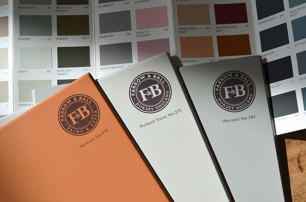
Marmelo – Farrow & Ball
Ella’s top choice is ‘Marmelo (316)’ by Farrow & Ball, a colour inspired by marmalade. It is described as a grounded orange hue. Ella says: “I just love a chill, calming orange and it makes me think of Paddington Bear’s marmalade sandwiches, which is nostalgic and comforting!”
Barley White – Dulux Trade With over 2000 Dulux Trade colours to choose from it could be tricky to name a favourite, but our team lists “Barley White” as a timeless favourite. It is an option chosen time and time again by our customers. A warm neutral perfect for all styles of home and can be mixed into all of Dulux Trade’s wonderful finishes.
Emperor's Silk – Annie Sloan Kirk’s favourite is ‘Emperor’s Silk’ by Annie Sloan, a bright pure red. Kirk loves red because, and quote, “all the best teams are red” and because it is such a powerful colour. This vibrant colour from the Annie Sloan collection, is deeply pigmented, hard wearing, and great for any at-home project.

Madeleine – Little Greene Darcy’s top pick is Little Greene’s ‘Madeleine (338)’. A muted-yellow and warm neutral. It comes from part of the Sweet Treats capsule collection and what’s lovely about this collection is that the colours are recreated from historical buildings making them timeless shades. ‘Madeleine’ would be a perfect shade to colour-drench a room in.

Worsted – Farrow & Ball Connor’s choice is Farrow & Ball’s ‘Worsted (284)’ which he likes so much he is currently painting his bedside tables in it. He is using the Flat Eggshell finish which is low-sheen, but also super tough making it incredibly long-lasting. Worsted is part of Farrow & Ball’s relaxed neutrals group and is a mid-grey with a real richness to it. It’s also perfect if you’re looking for a grey without cold tones.
Hornblende – Paint & Paper Library ‘Hornblende (186)’ is a Paint & Paper Library deep green colour. Lee has also named this colour as being one of his all-time favourites saying that it is an indescribable green, which is pleasing and relaxing to live with.
Purbeck Stone – Farrow & Ball Kirk loves Farrow and Ball’s ‘Purbeck Stone (275)’ so much so that he’s used it all over his home! Using several finishes, such as Estate Emulsion for walls in low-traffic areas, which gives beautiful depth of colour in a chalky matt finish and Modern Emulsion in hallways as it is washable and scuff-proof.


And that’s a wrap on our team’s top 10 colours. We know it can be useful to look at colour trends when starting projects in your home, but our advice is always to pick colours you are drawn to and love, to make your home truly feel like your space.


Comments